03 R Packages for fancy Heatmaps - ‘ComplexHeatmap’

My Favorite R/Python Package

Author
Affiliation

Richard Stöckl

Published

2024-12-04

So you want to create a Heatmap…

Heatmaps are a fundamental visualization method that is broadly used to explore patterns within multidimensional data. Let’s say you have some numerical data in a data frame or a presence/absence matrix.

df <- mtcars
head(df)
                   mpg cyl disp  hp drat    wt  qsec vs am gear carb
Mazda RX4         21.0   6  160 110 3.90 2.620 16.46  0  1    4    4
Mazda RX4 Wag     21.0   6  160 110 3.90 2.875 17.02  0  1    4    4
Datsun 710        22.8   4  108  93 3.85 2.320 18.61  1  1    4    1
Hornet 4 Drive    21.4   6  258 110 3.08 3.215 19.44  1  0    3    1
Hornet Sportabout 18.7   8  360 175 3.15 3.440 17.02  0  0    3    2
Valiant           18.1   6  225 105 2.76 3.460 20.22  1  0    3    1

Both can be turned into a heatmap with the built-in function heatmap() from base R (when you transform the df into a matrix first):

matrix <- as.matrix(df)
stats::heatmap(matrix)

So far so good! What if you want to customize the heatmap? Let’s check what parameters are available:

heatmap(x, Rowv = NULL, Colv = if(symm)"Rowv" else NULL,
        distfun = dist, hclustfun = hclust,
        reorderfun = function(d, w) reorder(d, w),
        add.expr, symm = FALSE, revC = identical(Colv, "Rowv"),
        scale = c("row", "column", "none"), na.rm = TRUE,
        margins = c(5, 5), ColSideColors, RowSideColors,
        cexRow = 0.2 + 1/log10(nr), cexCol = 0.2 + 1/log10(nc),
        labRow = NULL, labCol = NULL, main = NULL,
        xlab = NULL, ylab = NULL,
        keep.dendro = FALSE, verbose = getOption("verbose"), ...)

As you can see, the base function already has some customizability. However, there are some important features missing:

  • Annotations: Only basic color bars for rows and columns possible, no legends!
  • Layouts: No support for multiple heatmaps in one plot, or splitting of cells.
  • Integration: No integration with other plots.
  • Usability: Somewhat unintutive syntax.

High-level Heatmaps

As heatmaps are commonly used in analysis of big multidimensional datasets like genome-wide gene expression data1, or methylation profiling2, the basic functionality of the stats::heatmap() is often not enough. As a result, several specialized packages have been developed, some of which I want to showcase here:

package released last updated comment
pheatmap 2012 2019-01-04 Expands on the basic heatmap function to enable consistent text, cell and overall sizes and shapes. Also tries to simplify syntax.
ComplexHeatmap 2015 2024-11-25 Inspired by the `pheatmap` package, but much more flexible and added functionality.
tidyHeatmap 2020 2022-05-20 Introduces tidy principles to the creation of information-rich heatmaps. This package uses `ComplexHeatmap` as graphical engine.
tidyheatmaps 2023 2024-02-29 Provides a tidyverse-style interface to the `pheatmap` package and enables the generation of complex heatmaps from tidy data with minimal code.

Data for plotting

Let’s use the same data for each heatmap. The tidyheatmaps package includes a mock gene expression dataset which we willuse

gene_expression_data <- tidyheatmaps::data_exprs
head(gene_expression_data)
# A tibble: 6 × 9
  ensembl_gene_id    external_gene_name sample expression group sample_type
  <chr>              <chr>              <chr>       <dbl> <chr> <chr>      
1 ENSMUSG00000033576 Apol6              Hin_1        2.20 Hin   input      
2 ENSMUSG00000033576 Apol6              Hin_2        2.20 Hin   input      
3 ENSMUSG00000033576 Apol6              Hin_3        2.66 Hin   input      
4 ENSMUSG00000033576 Apol6              Hin_4        2.65 Hin   input      
5 ENSMUSG00000033576 Apol6              Hin_5        3.44 Hin   input      
6 ENSMUSG00000033576 Apol6              Ein_1        5.03 Ein   input      
# ℹ 3 more variables: condition <chr>, is_immune_gene <chr>, direction <chr>

The pheatmap (“pretty heatmaps”) package3

Main features:

  • ability to directly control the size of the cells, text, etc
  • automatic generation of legends
  • row and column annotations
  • ability to post-edit the heatmap using grid graphics tools
  • easy way to separate clusters visually using spacers
  • reasonable defaults
# pheatmap needs a matrix as input

gene_expression_data_mat <- gene_expression_data %>% tidyr::pivot_wider(id_cols=external_gene_name,values_from = expression, names_from = sample) %>% column_to_rownames("external_gene_name") %>% as.matrix()

pheatmap::pheatmap(gene_expression_data_mat)

Immediatly, we get a really usable heatmap with just the default settings! Let’s take a look at the defaults:

pheatmap(mat, color = colorRampPalette(rev(brewer.pal(n = 7, name =
  "RdYlBu")))(100), kmeans_k = NA, breaks = NA, border_color = "grey60",
  cellwidth = NA, cellheight = NA, scale = "none", cluster_rows = TRUE,
  cluster_cols = TRUE, clustering_distance_rows = "euclidean",
  clustering_distance_cols = "euclidean", clustering_method = "complete",
  clustering_callback = identity2, cutree_rows = NA, cutree_cols = NA,
  treeheight_row = ifelse((class(cluster_rows) == "hclust") || cluster_rows,
  50, 0), treeheight_col = ifelse((class(cluster_cols) == "hclust") ||
  cluster_cols, 50, 0), legend = TRUE, legend_breaks = NA,
  legend_labels = NA, annotation_row = NA, annotation_col = NA,
  annotation = NA, annotation_colors = NA, annotation_legend = TRUE,
  annotation_names_row = TRUE, annotation_names_col = TRUE,
  drop_levels = TRUE, show_rownames = T, show_colnames = T, main = NA,
  fontsize = 10, fontsize_row = fontsize, fontsize_col = fontsize,
  angle_col = c("270", "0", "45", "90", "315"), display_numbers = F,
  number_format = "%.2f", number_color = "grey30", fontsize_number = 0.8
  * fontsize, gaps_row = NULL, gaps_col = NULL, labels_row = NULL,
  labels_col = NULL, filename = NA, width = NA, height = NA,
  silent = FALSE, na_col = "#DDDDDD", ...)

We can see that by default:

  • no scaling is applied (but we can change that)
  • both rows and columns are clustered (we can change the function for that)
  • a legend is automatically generated

And we can see, that we can easily customize parameters like:

  • breaking the heatmpa via k-means clustering
  • change the trees
  • add annotations
  • change fonts and cell sizes/colours etc
# lets create some annotations
sample_annot_df <- gene_expression_data %>% select(sample,group,sample_type,condition) %>% distinct() %>% column_to_rownames("sample")
gene_annot_df <- gene_expression_data %>% select(external_gene_name,is_immune_gene,direction) %>% distinct() %>% column_to_rownames("external_gene_name")

pheatmap::pheatmap(gene_expression_data_mat,
                   color = colorRampPalette(c("navy", "white", "firebrick3"))(50),
                   cluster_rows = T, cluster_cols = T,
                   clustering_distance_cols = 'euclidean',
                   clustering_distance_rows = 'euclidean',
                   clustering_method = 'ward.D',
                   annotation_row = gene_annot_df,
                   annotation_col = sample_annot_df,
                   annotation_names_row = F, 
                   annotation_names_col = F,
                   fontsize_row = 10,
                   fontsize_col = 7,
                   angle_col = 45,
                   show_colnames = T, show_rownames = F,
                   main = "pheatmap with annotations")

The pheatmap package gets the job done, even though the annotation and coloring takes getting used to. The biggest problem is, that THERE IS NO VIGNETTE OR TUTORIAL OR DOCUMENTATION, other than the basic help page.

The tidyheatmaps package4

Main features:

  • offers an interface to the powerful pheatmap package
  • allows for the effortless creation of intricate heatmaps with minimal code
  • contains all of the pheatmap features
# tidyheatmaps can use the df directly:
tidyheatmaps::tidyheatmap(df = gene_expression_data,
                          rows = external_gene_name,
                          columns = sample,
                          values = expression)

# tidyheatmaps can use the df directly:
tidyheatmaps::tidyheatmap(df = gene_expression_data,
                          rows = external_gene_name,
                          columns = sample,
                          values = expression,
                          # annotation is REALLY easy
                          annotation_col = c(sample_type, condition, group),
                          annotation_row = c(is_immune_gene, direction),
                          # other features are as simple as turning them on:
                          cluster_rows = TRUE,
                          cluster_cols = TRUE,
                          display_numbers = TRUE,
                          # all of the pheatmap features are available
                          fontsize_row = 10,
                          scale = "none",
                          colors = colorRampPalette(c("navy", "white", "firebrick3"))(50),
                          color_legend_n = 50,
                          fontsize_col = 7,
                          angle_col = 45,
                          show_colnames = T, show_rownames = F,
                          main = "tidyheatmaps with annotations"
)

The tidyheatmaps package is basically just an interface to pheatmap, but it makes the creation much simpler. Also, there is a bit more documentation available (albeit not that much more)

The tidyHeatmap package5

The tidyHeatmap package is developed by the same author that created the tidygate, tidySingleCellExperiment, tidyseurat, tidybulk, and tidySummarizedExperiment packages. It uses the ComplexHeatmap package as graphical engine. Main features: * Modular annotation with just specifying column names * Custom grouping of rows is easy to specify providing a grouped tbl. For example df |> group_by(…) * Labels size adjusted by row and column total number * Default use of Brewer and Viridis palettes

# tidyHeatmap can use the df directly:
tidyHeatmap::heatmap(gene_expression_data,
                     .row = external_gene_name,
                     .column = sample,
                     .value = expression)
tidyHeatmap says: (once per session) from release 1.7.0 the scaling is set to "none" by default. Please use scale = "row", "column" or "both" to apply scaling

tidyHeatmap::heatmap(gene_expression_data %>%
      # grouping is done directly via the dataframe:
                     group_by(condition),
                     .row = external_gene_name,
                     .column = sample,
                     .value = expression) %>%
  # annotations are done a bit differently:
  tidyHeatmap::add_tile(c(sample_type,condition,group, is_immune_gene,direction))
Warning: `add_tile()` was deprecated in tidyHeatmap 1.9.0.
ℹ Please use `annotation_tile()` instead

# tidyHeatmaps lets you do some crazy stuff with annotations:
tidyHeatmap::heatmap(gene_expression_data %>%
      # lets add some more random data for annotation types
                    tidyr::nest(data = -sample) |>
                    dplyr::mutate(val1 = rnorm(n(), 4,0.5)) |>
                    dplyr::mutate(val2 = runif(n(), 50, 200)) |>
                    dplyr::mutate(val3 = runif(n(), 50, 200)) |>
                    tidyr::unnest(data),
                     .row = external_gene_name,
                     .column = sample,
                     .value = expression) %>%
  # annotations are done a bit differently:
  tidyHeatmap::add_tile(c(sample_type,condition,group, is_immune_gene,direction)) %>%
    add_bar(val1) |>
    add_point(val2) |>
    add_line(val3)
Warning: `add_bar()` was deprecated in tidyHeatmap 1.9.0.
ℹ Please use `annotation_bar()` instead
Warning: `add_point()` was deprecated in tidyHeatmap 1.9.0.
ℹ Please use `annotation_point()` instead
Warning: `add_line()` was deprecated in tidyHeatmap 1.9.0.
ℹ Please use `annotation_line()` instead

The tidyHeatmap package is designed with biological data in mind, and provides a nice interface to the ComplexHeatmap package. It has some decent documentation, however the documentations is outdated at times.

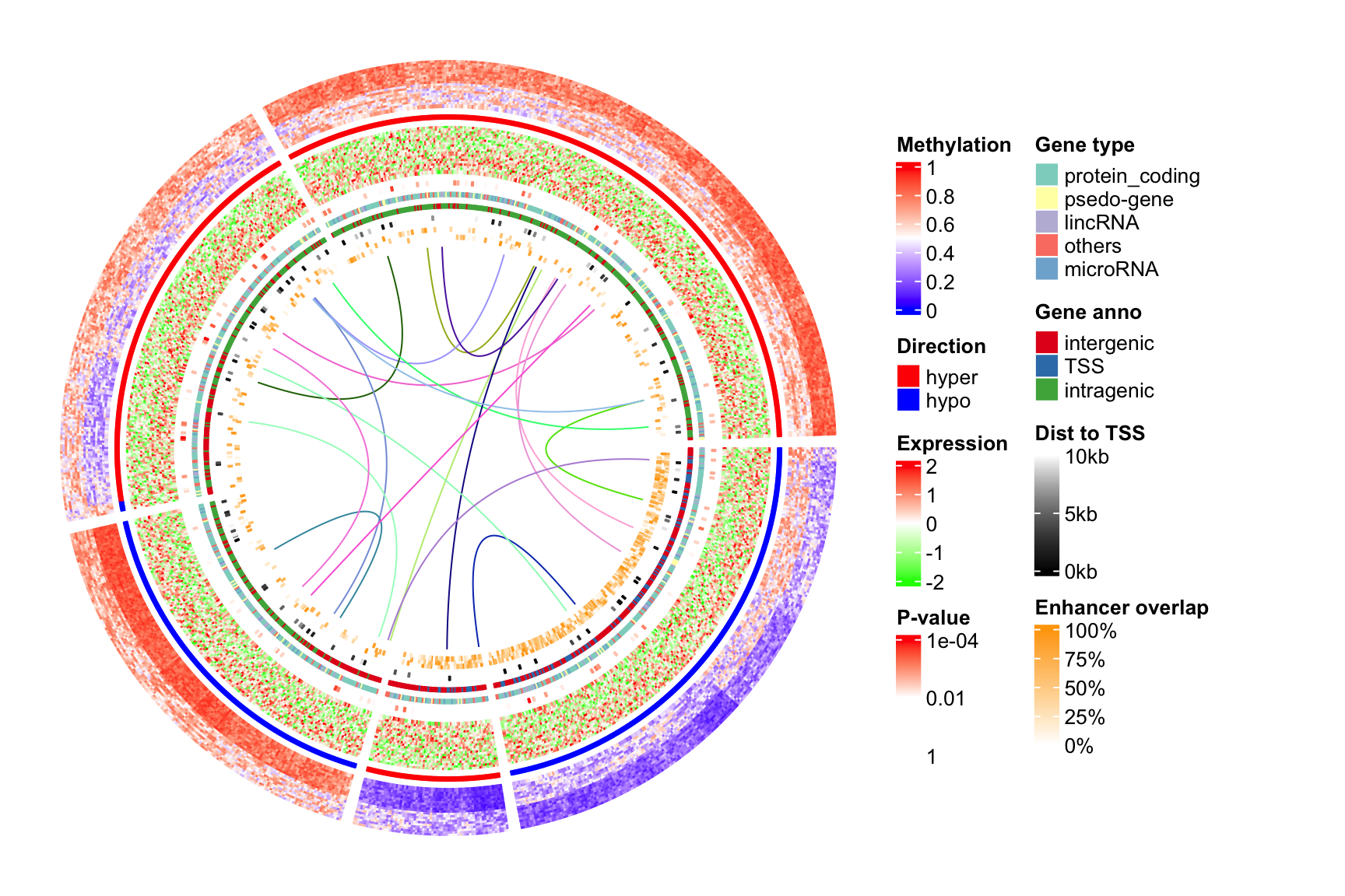
The ComplexHeatmap package67 - the best of the best

Introduction

The ComplexHeatmap package is developed by Zuguang Gu (aka “jokergoo”), who also created incredible packages like circlize, EnrichedHeatmap, simplifyEnrichment, rGREAT, BioMartGOGeneSets, and many more!

So much documentation!

The best thing about the ComplexHeatmap package is its documentation:

Let’s check out the basics first:

# ComplexHeatmap uses a matrix as input
ComplexHeatmap::Heatmap(gene_expression_data_mat)

This is obviously a very basic heatmap, that could not be used in a publication like that. Let’s look at the incredible documentation and see what we can do to make it better!

Customization

General Design

A ComplexHeatmap is composed of multiple components:

Manipulate the Colours, Titles, and Dimension labels

One can adjust any part of the main heatmap colours:

Or any part of the titles and dimension lables:

Titles

Dimension labels

Heatmap Annotations and Legends

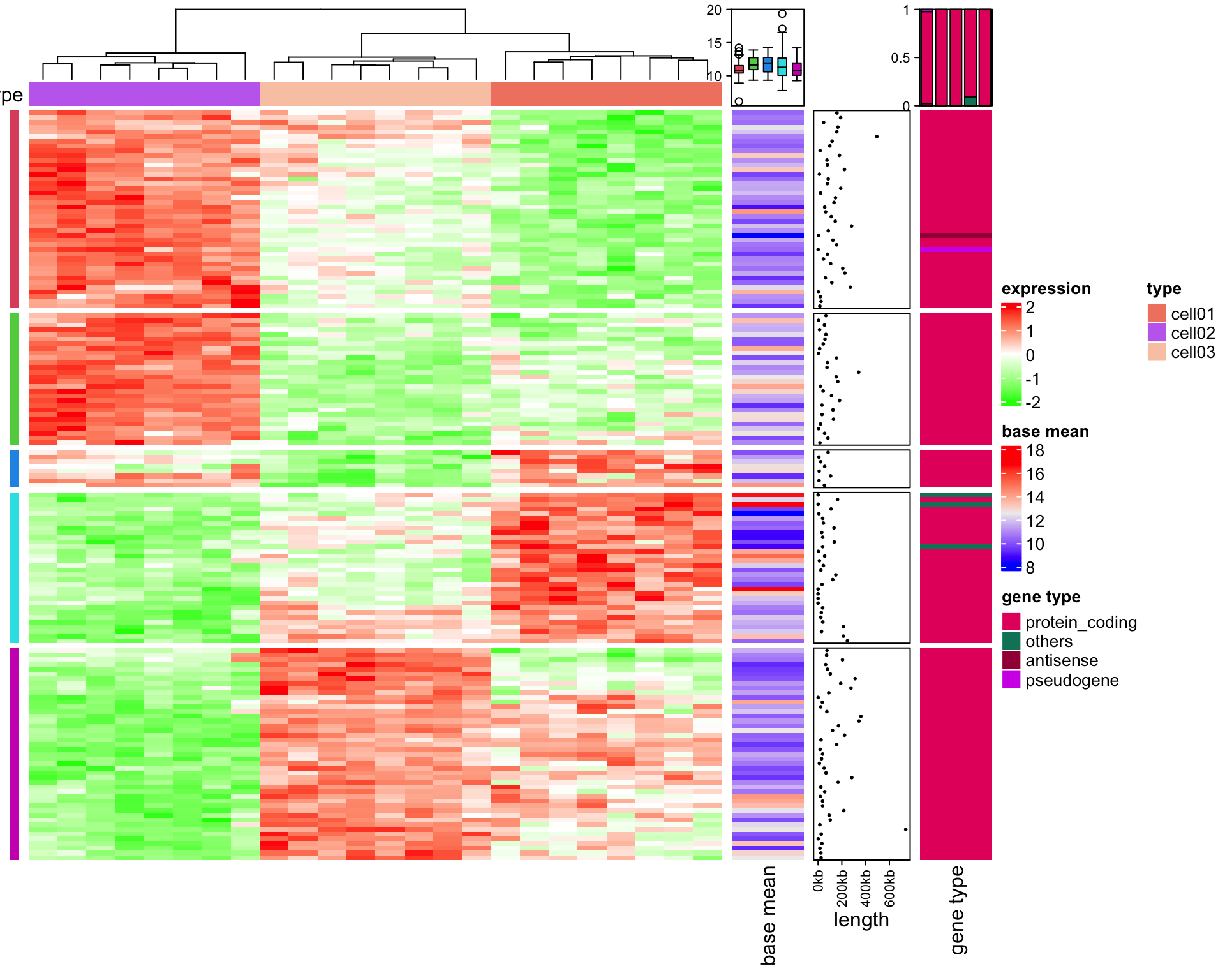
The most versatile - but also complex - part of the ComplexHeatmap package is the manipulation of the annotations and legends. You can basically customize every single aspect.

Annotations can be blocks/points/lines/text…

..or Barplots..

..Boxplots..

…density plots or joyplots…

…or whatever you want

Legends can also be customized heavily:

Discrete and continuous custom legends

Decoration of other parts of the Heatmap

Any of the highlighted parts of a heatmap can be decorated:

This includes the heatmap cells:

And obviously the size of the entire heatmap aswell.

Biologically relevant examples of ComplexHeatmap’s

  1. A gene expression heatmap:

  1. The measles vaccine works!:

  1. Methylation Profiling:

But wait, there is more!

  1. Add one line of code and turn your heatmap into an interactive one via InteractiveComplexHeatmap!

  1. Turn your heatmap into 3D via Heatmap3D()!

  1. Convert any pheatmap::pheatmap() into a ComplexHeatmap::Heatmap() using ComplexHeatmap::pheatmap()

  2. Combine the circlize package with the ComplexHeatmap package for circular heatmaps!

Heatmaps so Complex, you wouldn’t even recognize them anymore

Density Maps

Density Maps

UpSet plots

UpSet plots

Correlation plots

Correlation plots

GO game??

GO game??

Back to our example

# create annotations
samples_ha = HeatmapAnnotation(
              type = sample_annot_df$sample_type,
              condition = sample_annot_df$condition,
              # group = sample_annot_df$group,
              col = list(type = c("input"="#212E52","IP"="#D8511D"),
                         condition = c("healthy"="#8087AA","EAE"="#FEB424"),
                         group = c("Hin"="#0067A2","Ein"="#DFCB91","Hip"="#CB7223","Eip"="#289A84"))
)


genes_ha = HeatmapAnnotation(which = "row",
              show_annotation_name = FALSE,
              is_immune_gene = gene_annot_df$is_immune_gene,
              direction = gene_annot_df$direction,
              col = list(is_immune_gene = c("yes"="#DE3C37","no"="#082544"),
                         direction = c("up"="#79668C","down"="#F2DC7E"))
)

# heatmap
ComplexHeatmap::Heatmap(gene_expression_data_mat,
                                 name="Normalized Expression Level",
                                 border = T,
                                 cluster_columns = T,
                                 cluster_rows = T,
                                 show_column_dend = T,
                                 show_column_names = T,
                                 row_title = "Top DEG",
                                 row_title_side = "left",
                                 row_names_gp = gpar(fontsize = 6), # just for this document
                                 column_names_gp = gpar(fontsize = 8), # just for this document
                                 column_split = sample_annot_df$group,
                                 top_annotation = samples_ha,
                                 left_annotation = genes_ha,
                                 col=c("black","#FEB424"))

Conclusion

The ComplexHeatmap package is incredibly versatile. It has a steep learning curve attached to it, but it is very worth it to learn with the great documentation. There also are some packages that make the transistion easier.

References

1.
Eisen, M. B., Spellman, P. T., Brown, P. O. & Botstein, D. Cluster analysis and display of genome-wide expression patterns. Proceedings of the National Academy of Sciences 95, 14863–14868 (1998).
2.
3.
Kolde, R. Pheatmap: Pretty Heatmaps. (2019).
4.
5.
Mangiola, S. & Papenfuss, A. tidyHeatmap: An R package for modular heatmap production based on tidy principles. Journal of Open Source Software 5, 2472 (2020).
6.
Gu, Z., Eils, R. & Schlesner, M. Complex heatmaps reveal patterns and correlations in multidimensional genomic data. Bioinformatics 32, 2847–2849 (2016).
7.
Gu, Z. Complex heatmap visualization. iMeta 1, e43 (2022).